Donde la Tia Li
Where joy paints the walls of a clinic, a smile emerges in bright colors, easing fears and welcoming every child.
Donde La Tia Li
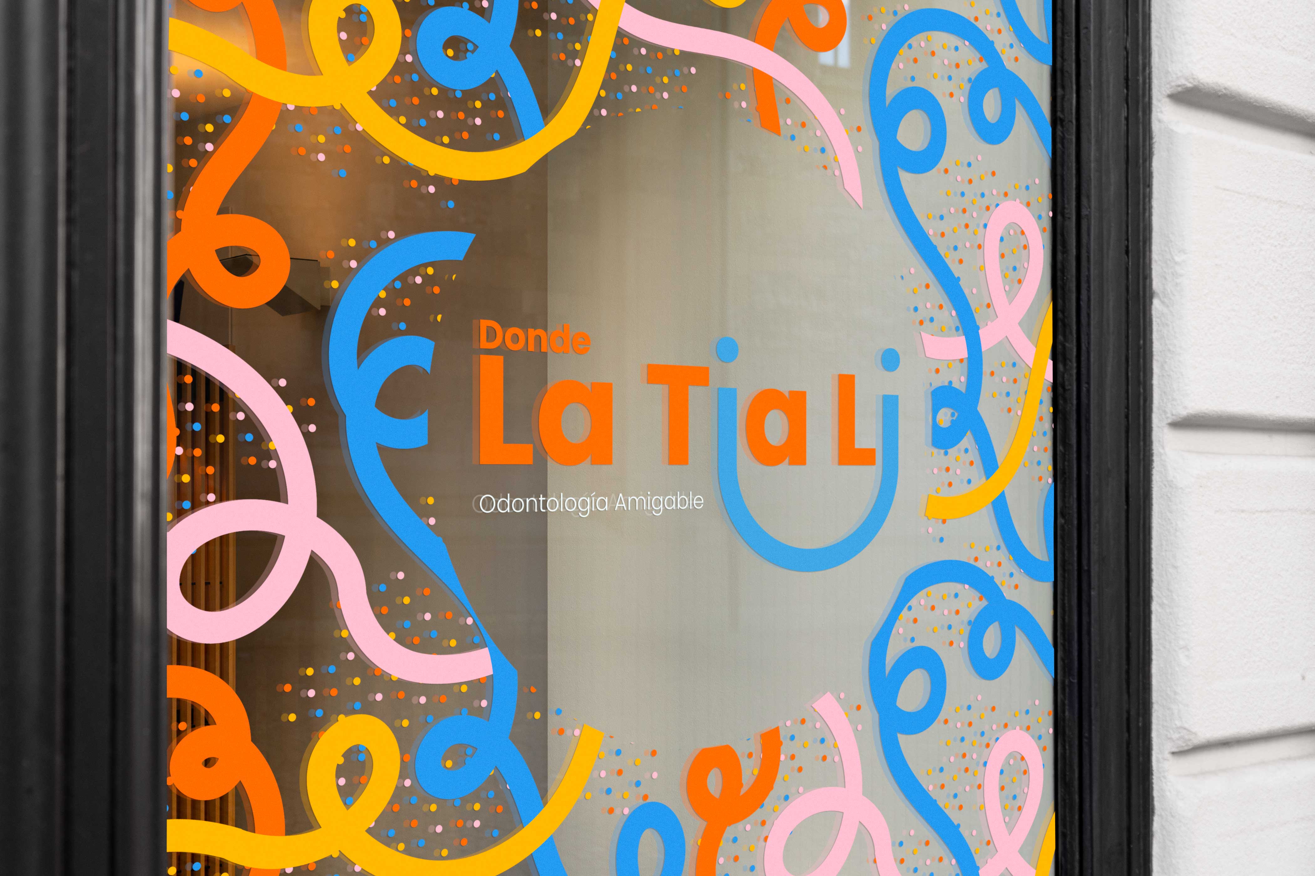
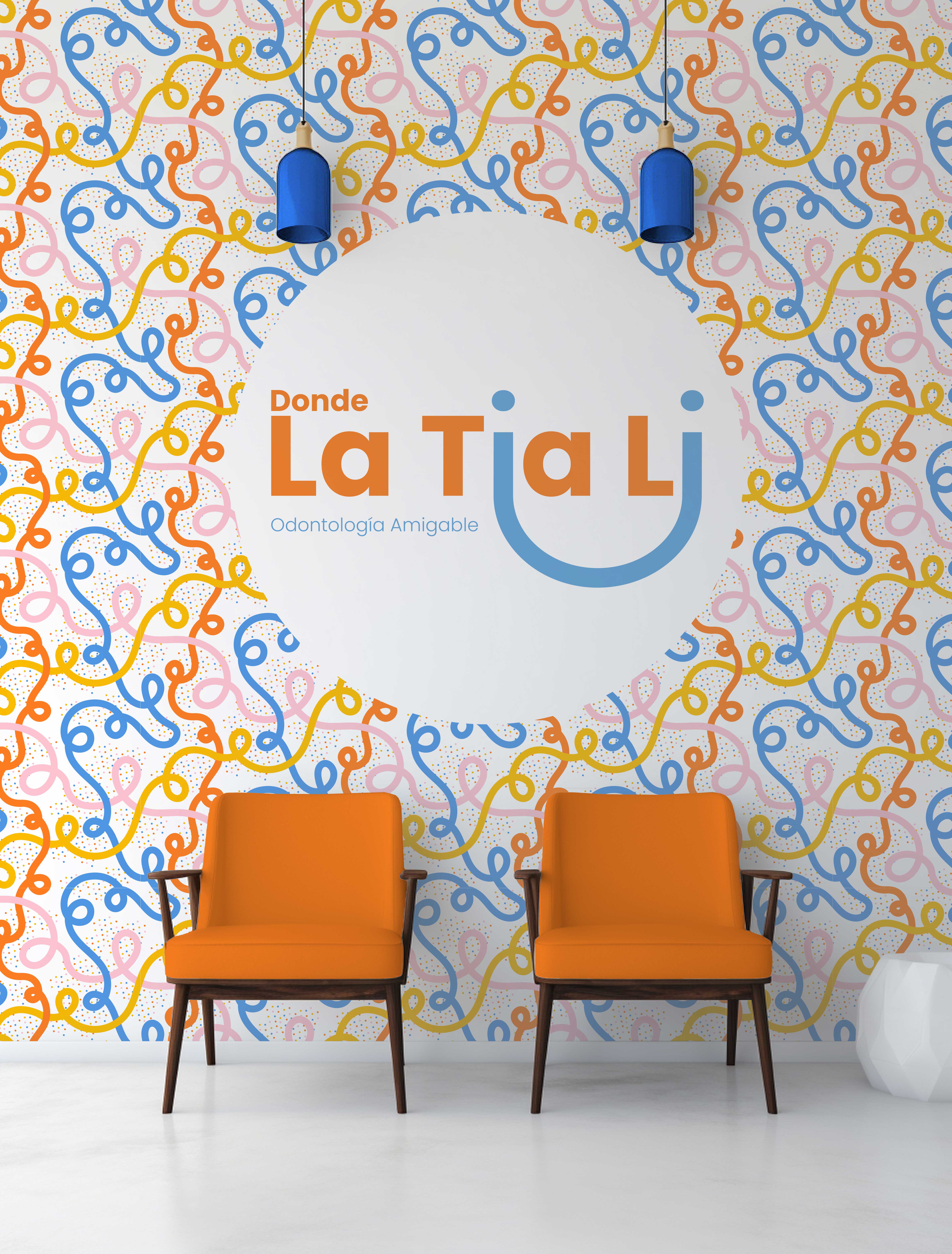
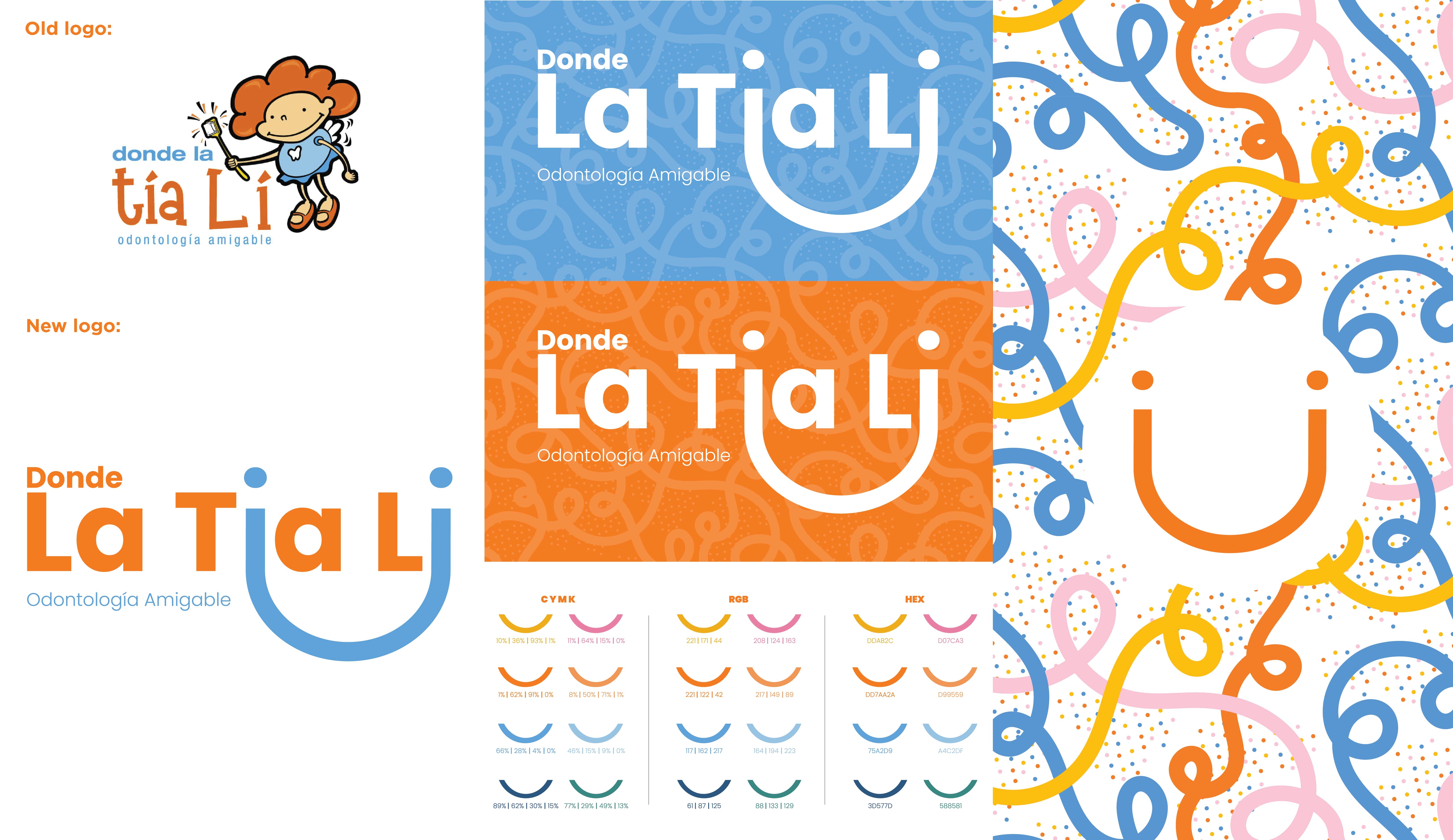
“Donde la Tía Li, a pediatric dental clinic specializing in children and adolescents, sought to refresh an outdated identity that no longer resonated with its audience. The former logo, represented by a tooth fairy and hard-to-read typography, lacked warmth and connection. The challenge was to create a new identity that was friendly, approachable, and joyful, while still conveying professionalism and trust. The decision was made to preserve the orange and blue palette — colors associated with vitality and cleanliness — but reinterpret the fairy’s smile as a typographic element. The extended “i” letters became a curved smile, a subtle yet memorable symbol of the brand.
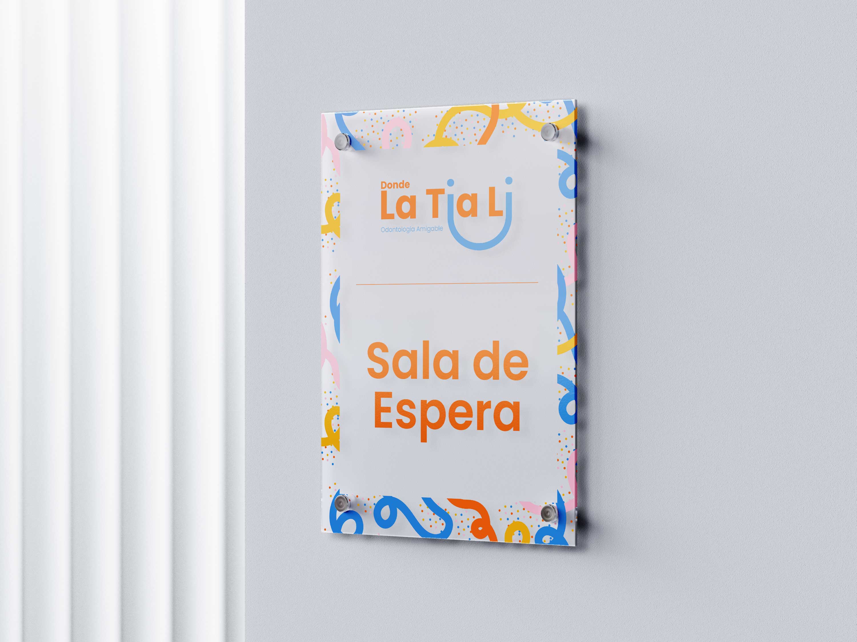
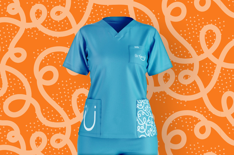
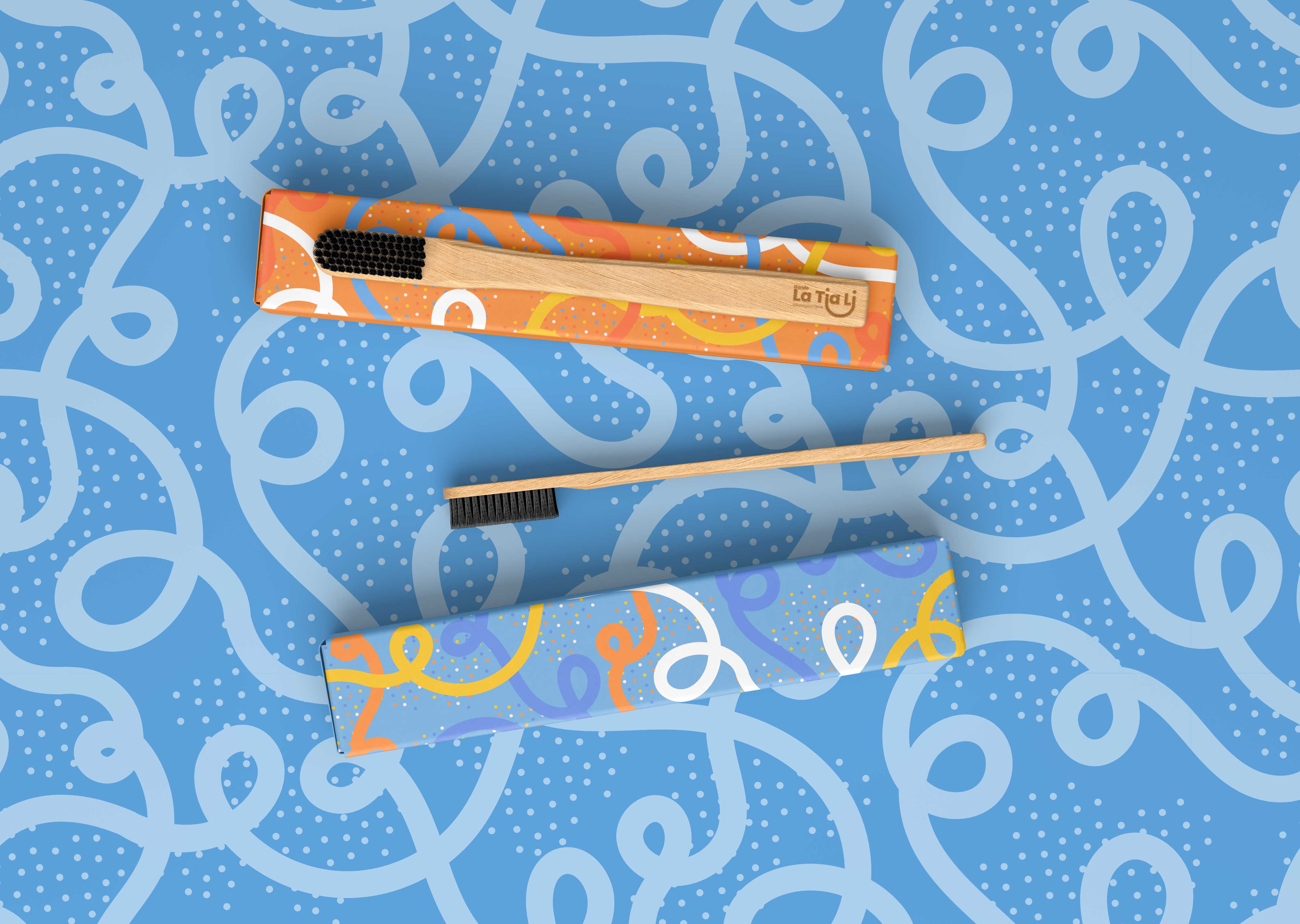
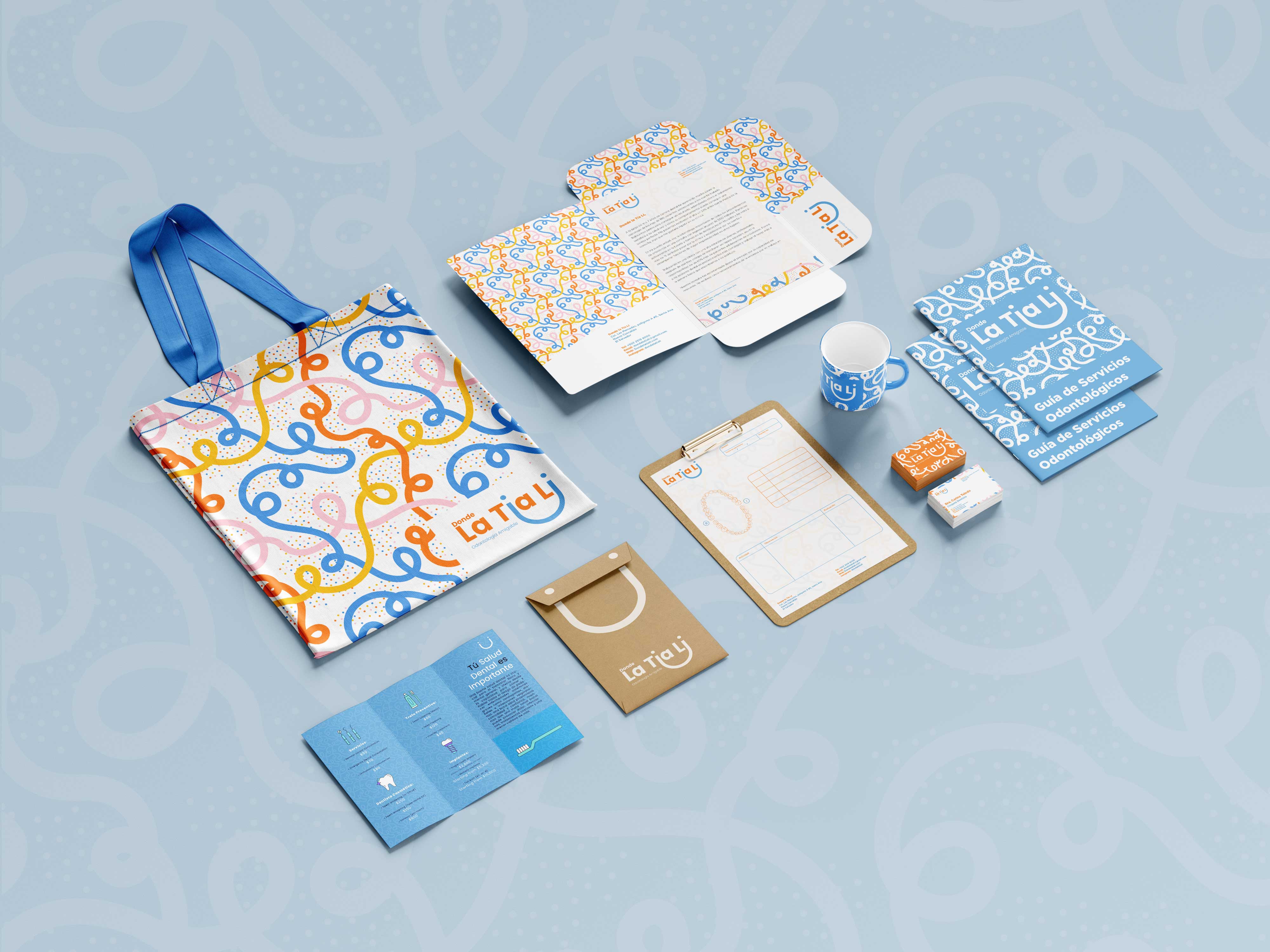
The rebranding evolved into a vibrant and dynamic visual system, defined by organic shapes and playful, eye-catching colors designed to engage children and reassure parents. The new identity was applied across uniforms, stationery, clinic décor, and promotional giveaways like tote bags, toothbrushes, and mugs. Walls and glass partitions were also transformed into cheerful graphic environments that reduced the stress often linked to dental visits. The result is a brand identity that feels fresh, welcoming, and aligned with the joyful care that defines Donde la Tía Li.
Next Project >
< Previous Project
