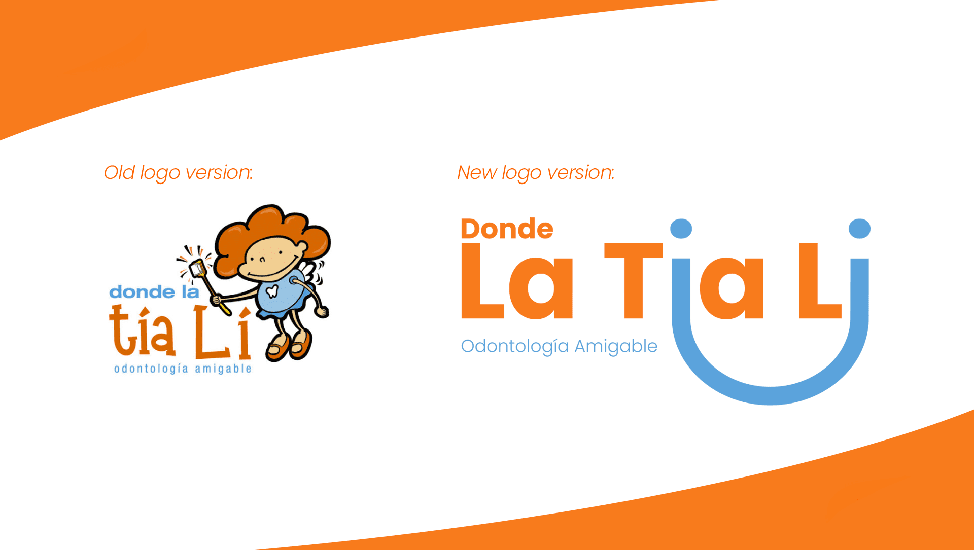
La Tia Li is a children's dental clinic that was looking for a change. A brand that was completely tied to its mascot within the logo but that made it look saturated.
The decision taken for this redesign was to keep the colors of the brand to have an anchor with its old version. It was also simplified to a visually recognizable shape such as the smile, allowing it to look dynamic but serious at the same time.
Previous Project
Next Project