Creategia
Somewhere between creativity and strategy, a pencil traces resilience, teaching that every idea begins with practice.
Creategia
Tipe of project
Rebranding
client
Grupo Creategia
Role
Art Direction, Graphic Design
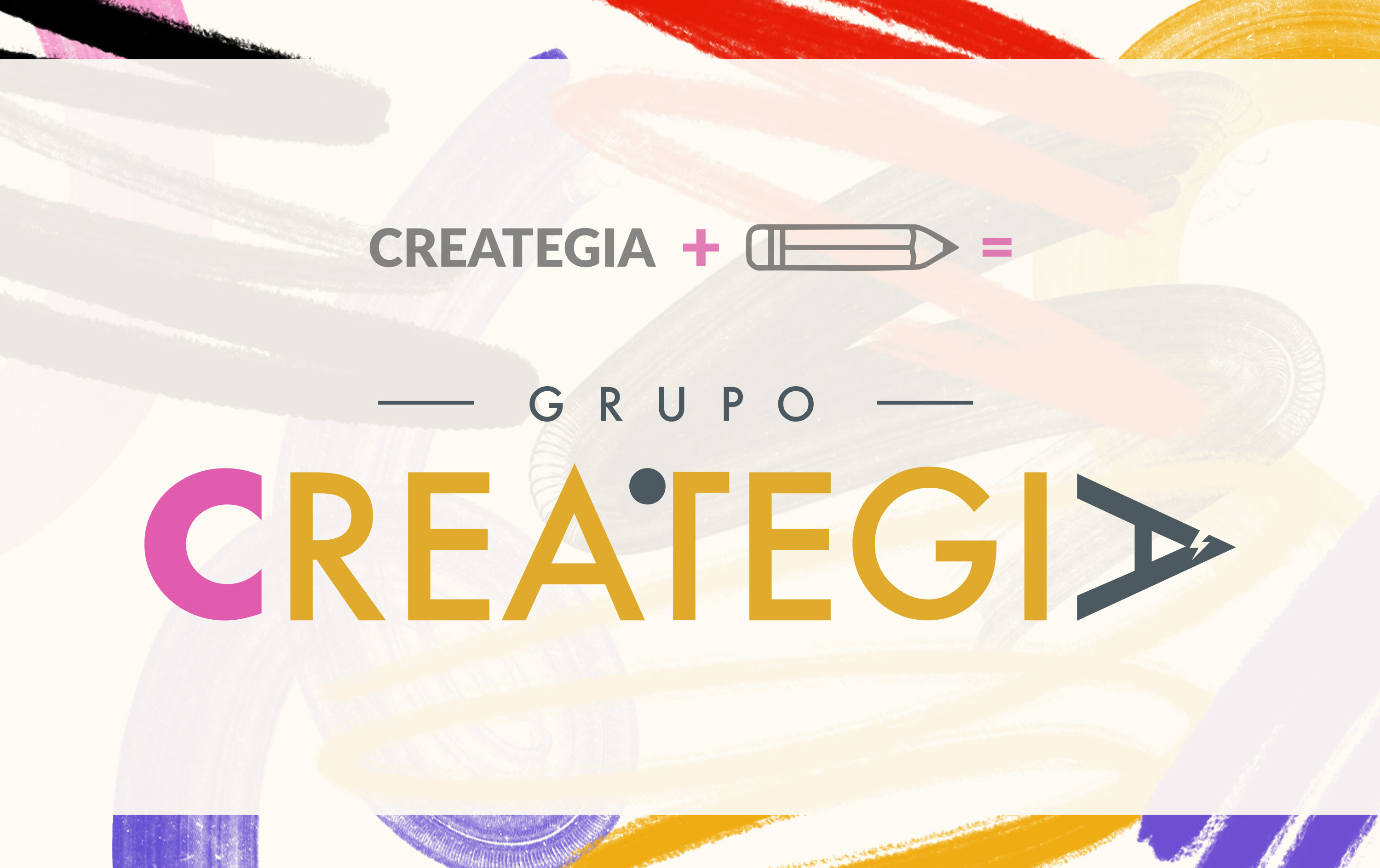
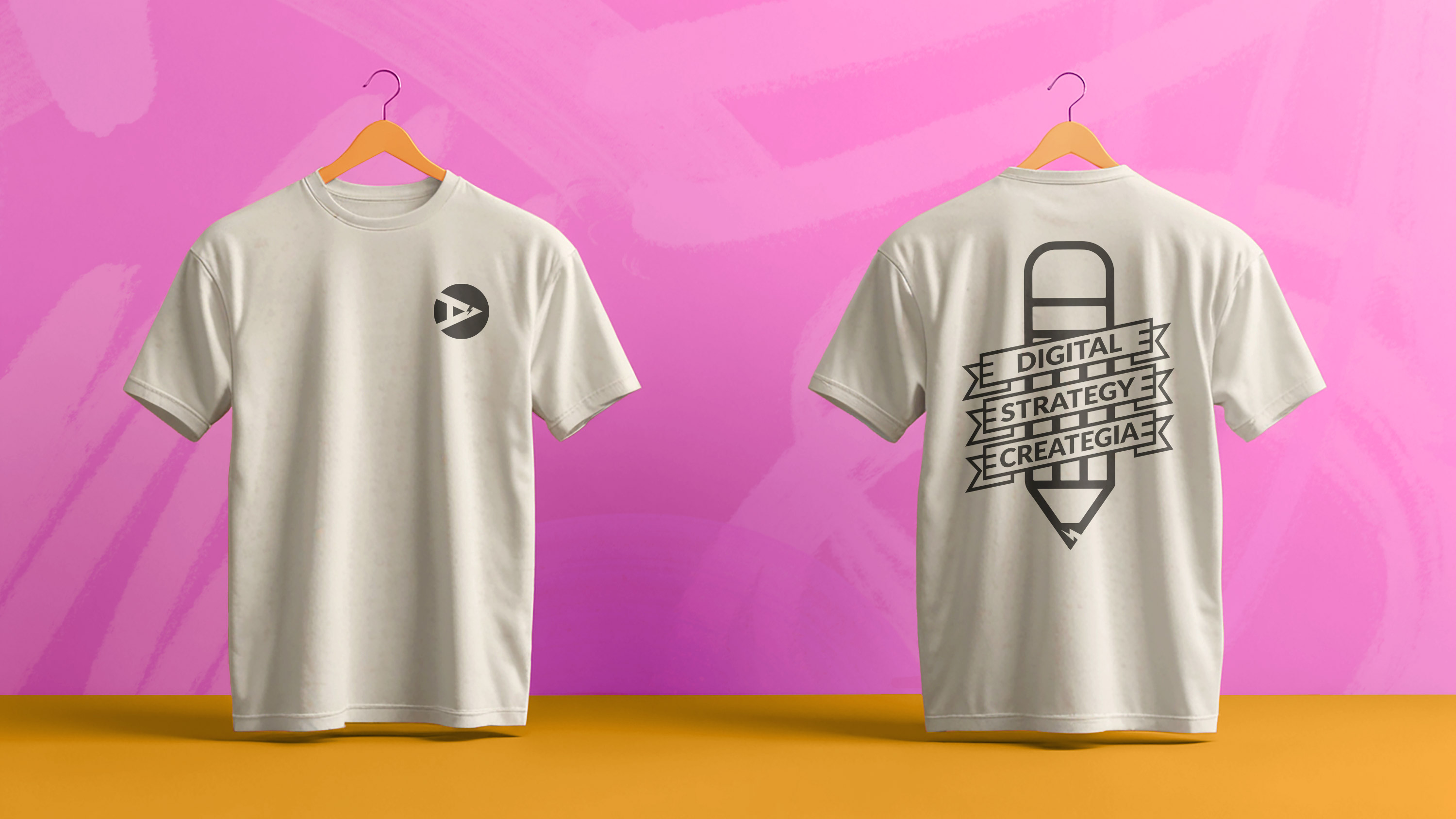
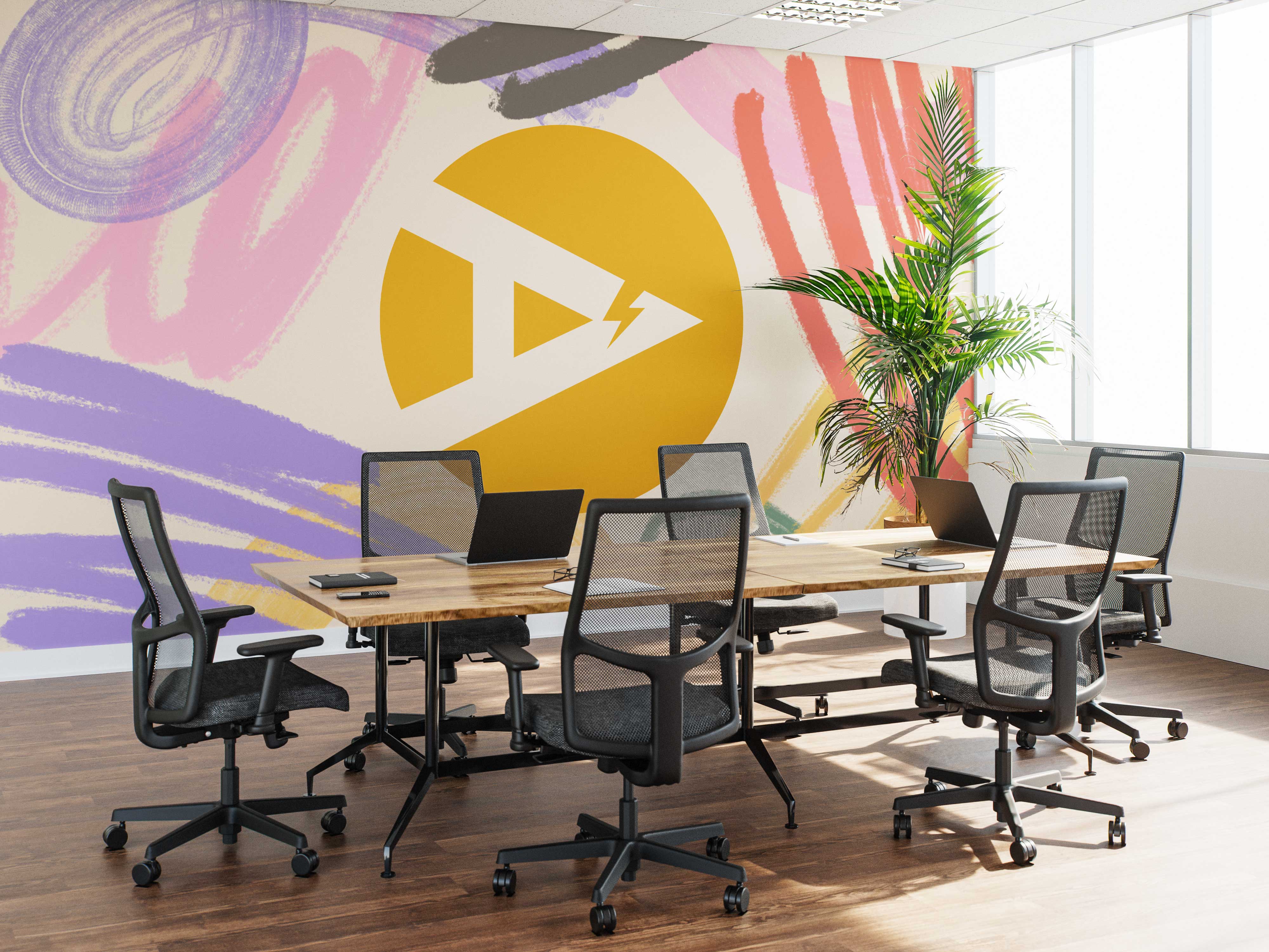
The redesign of Creategia emerged from a play on words in Spanish: creativity and strategy. The need for a new identity came when the brand realized its former visual system failed to stand out in a crowded market. During conversations with the client, two insights stood out: first, the company’s educational vocation, focused more on teaching and supporting businesses than simply acting as an agency; and second, the founder’s remark comparing marketing to the process of learning to write — something built through constant practice. From this reflection, the pencil became the central symbol, representing creativity, learning, and resilience. Its slightly broken tip symbolizes adaptability, an essential quality in the ever-changing world of marketing.
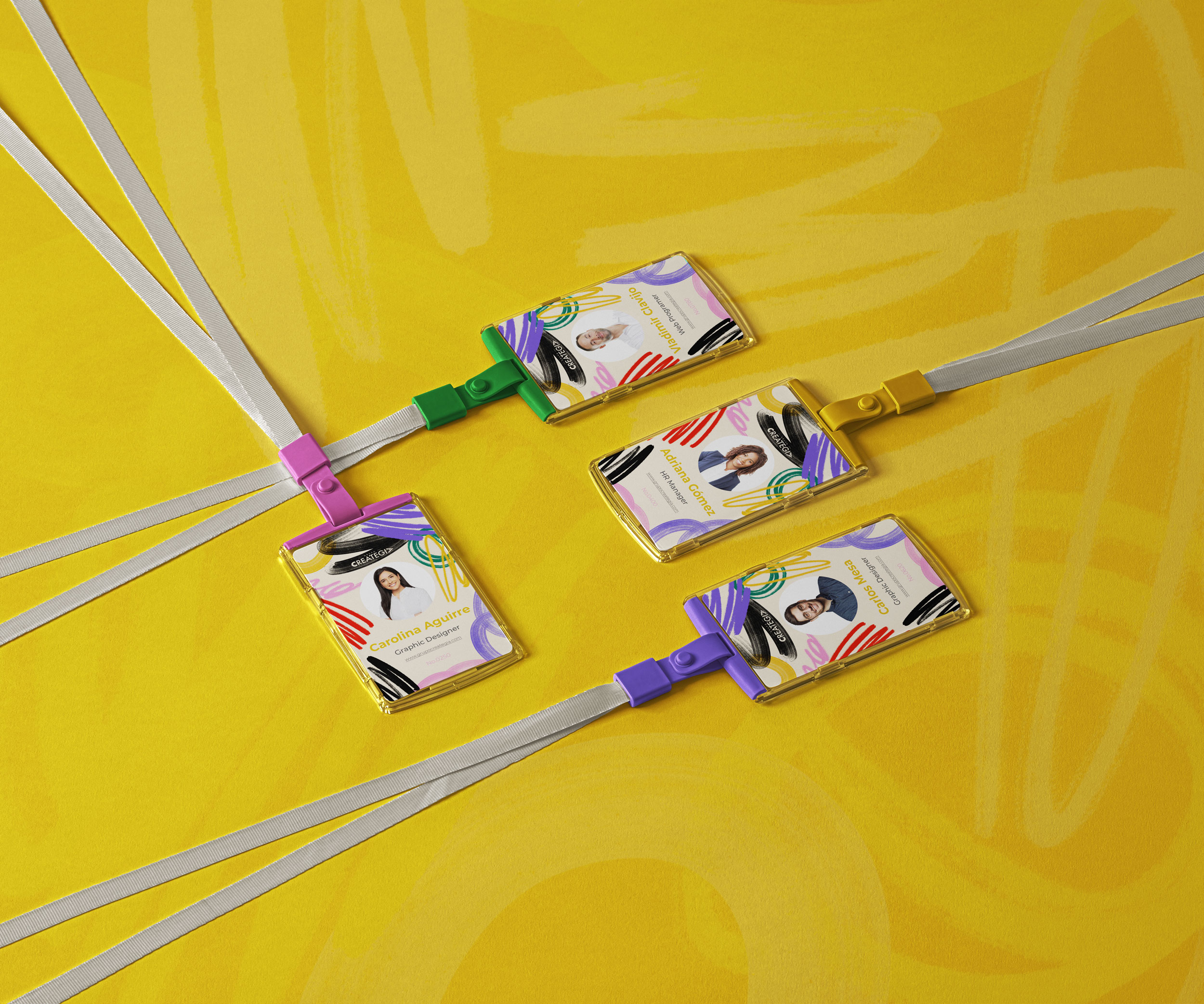
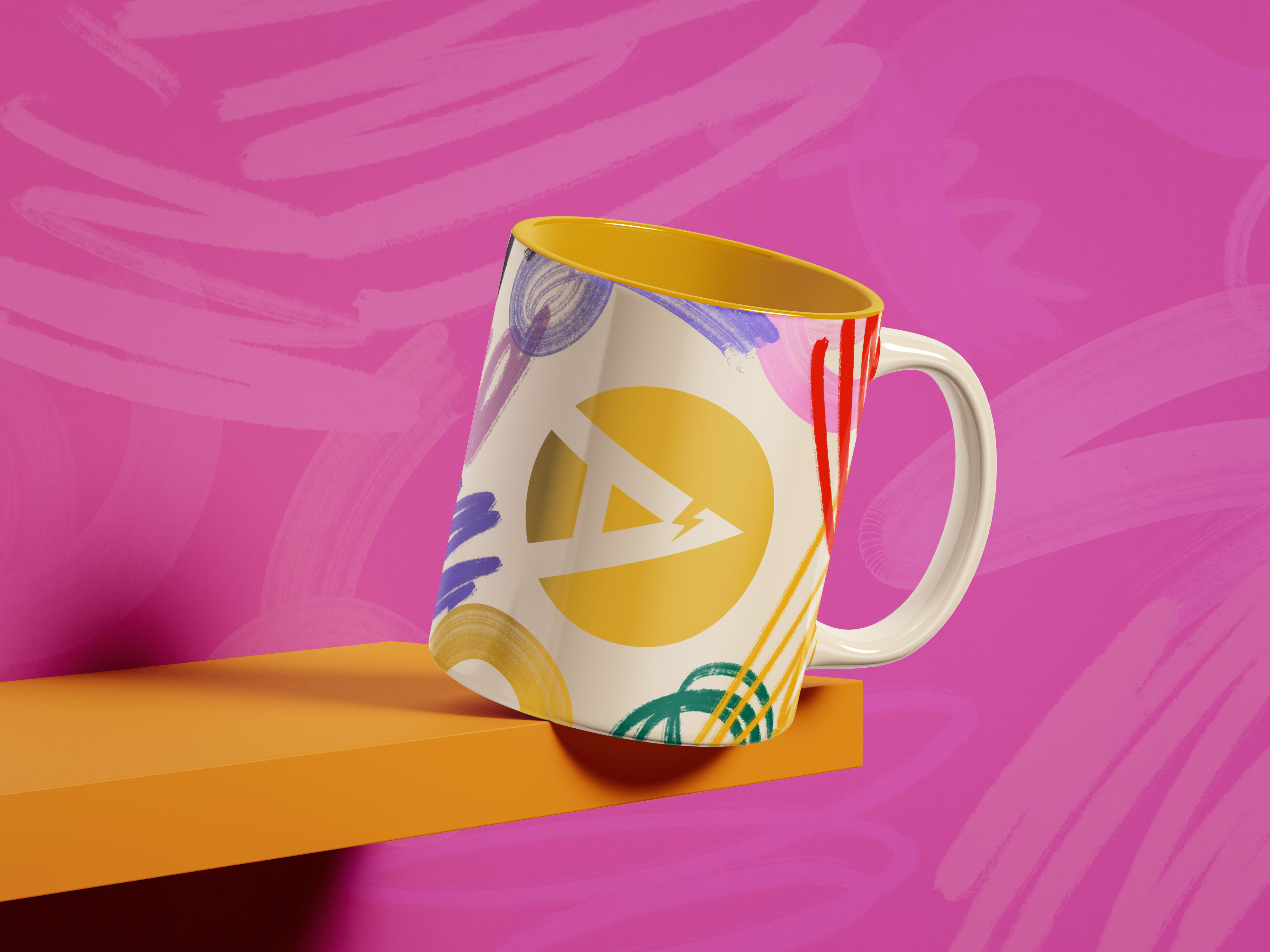
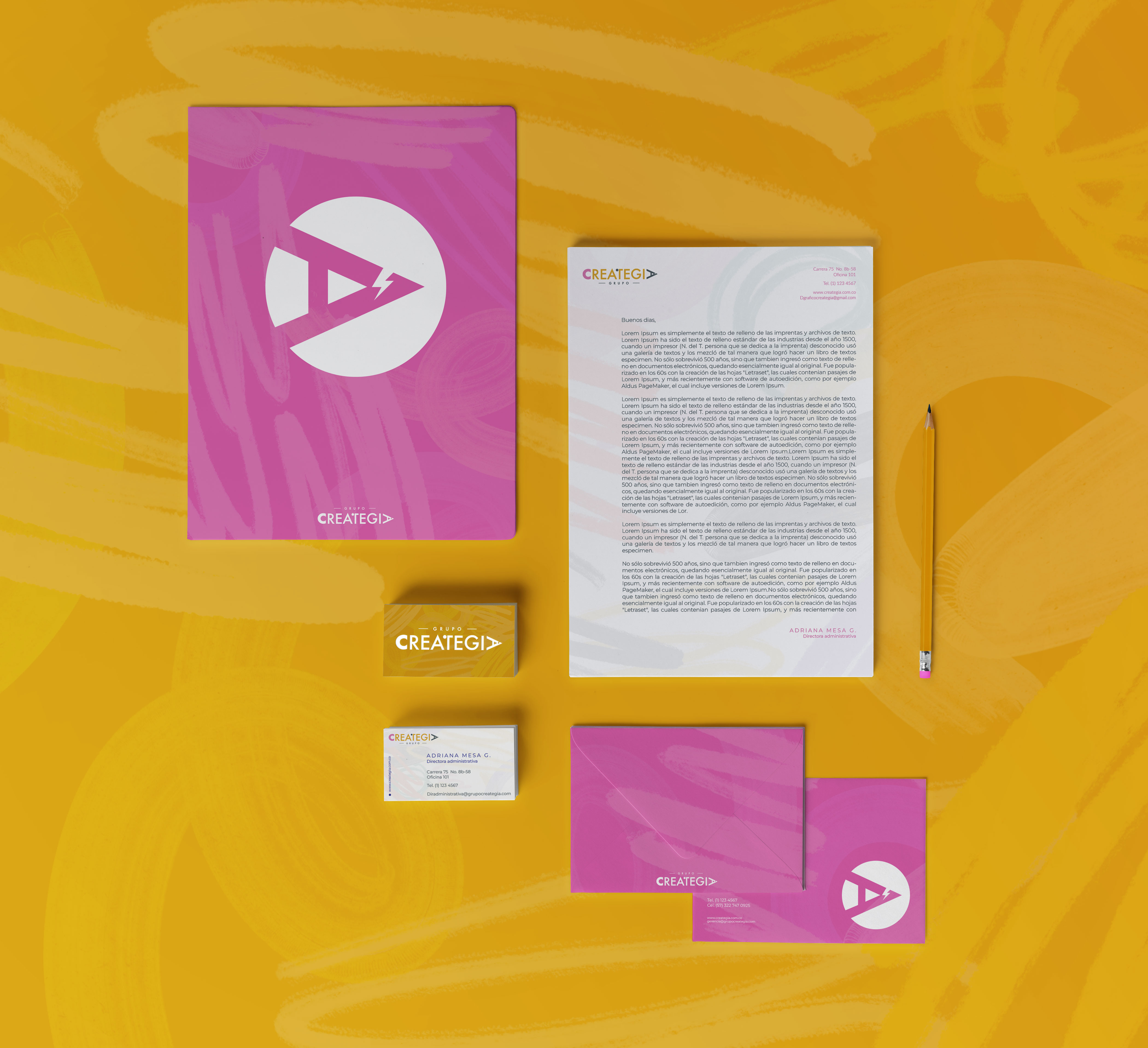
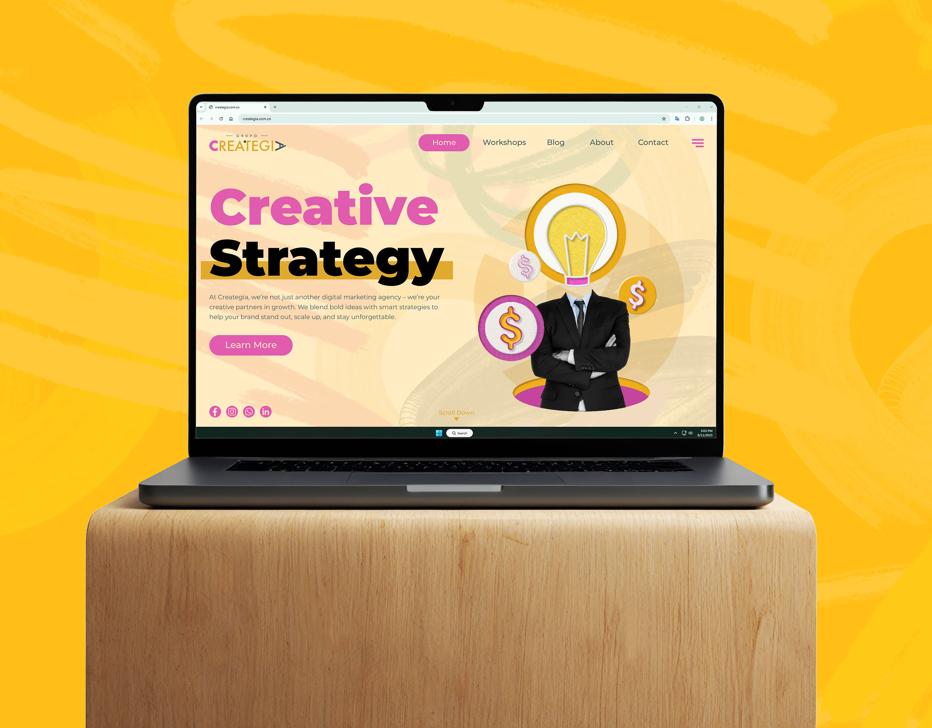
The result is a colorful and vibrant visual identity that conveys optimism, energy, and dynamism. The logotype cleverly integrates the brand’s name into the shape of a pencil, making it both versatile and memorable. The new system extended to multiple applications, including stationery, event T-shirts, interior signage, and a website. Each piece reinforces Creategia’s approachable, didactic personality, showing that behind creativity and strategy lies a clear purpose: to guide, to teach, and to empower.
Next Project >
< Previous Project